Table of contents:
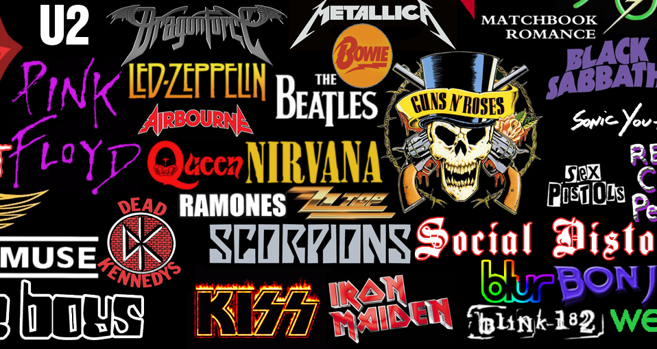
A rock band’s logo is much more than just an image – it’s a symbol of their identity, philosophy, and influence on music culture. Over the decades, some band logos have transcended their original purpose to become global icons, instantly recognizable by fans and non-fans alike. Let’s explore the stories and meanings behind some of the most iconic rock band logos, particularly those from British bands that have left an indelible mark on rock history.
1. The Rolling Stones: The Tongue and Lips
The Rolling Stones’ “Tongue and Lips” logo, designed in 1970 by John Pasche, is one of the most recognizable symbols in rock history. Initially created for the band’s album “Sticky Fingers,” the logo was inspired by Mick Jagger’s lips and the Hindu goddess Kali, symbolizing rebellion, sensuality, and a devil-may-care attitude.
The design encapsulates the Stones’ raw energy and their defiance of convention. Over the years, this logo has appeared on everything from album covers to T-shirts, making it a cornerstone of rock band merchandise worldwide.
2. Queen: The Royal Crest
Freddie Mercury himself designed Queen’s royal crest logo, combining elements that represented the band’s members and their shared vision. The design features two lions (representing John Deacon and Roger Taylor), a crab (Cancer for Brian May), and two fairies (Virgo for Mercury), all surrounding a phoenix symbolizing rebirth and immortality.
The intricate logo mirrors the theatrical and elaborate nature of Queen’s music. Found on their albums, merchandise, and concert visuals, the crest has become synonymous with the band’s legacy and their unique blend of operatic rock.
3. Pink Floyd: The Prism
While Pink Floyd’s prism logo wasn’t originally intended as a band logo, it has become one of the most iconic images in rock. Designed by Storm Thorgerson and George Hardie for the album “The Dark Side of the Moon” (1973), the prism symbolizes light, science, and mystery. The refracted light beam speaks to the band’s ability to transform complex concepts into beautiful, harmonious music.
This minimalist design has been endlessly reproduced on rock band music merchandise, including posters, T-shirts, and even home decor, making it a must-have for collectors.
4. Led Zeppelin: The Four Symbols
Led Zeppelin’s logo is unique in that it doesn’t consist of a single image but rather four distinct symbols, each representing a band member. The band debuted these symbols on their fourth album, often referred to as “Led Zeppelin IV.”
- Jimmy Page’s symbol, a stylized “Zoso,” remains a mystery to this day.
- John Paul Jones chose a triquetra, symbolizing confidence and competence.
- John Bonham’s interlocking circles signify family and unity.
- Robert Plant’s feather in a circle represents truth and a connection to ancient civilizations.
These symbols reflect each member’s individuality while collectively emphasizing their unity as a band. Their mystery and aesthetic appeal make them a frequent feature on hard rock merchandise.
5. The Beatles: The Drop-T Logo
The Beatles’ “Drop-T” logo, designed by Ivor Arbiter in 1963, is a clean and simple representation of the band’s name. It features elongated letters, with the “T” in Beatles standing out as a subtle nod to a drum kit.
Though minimalistic, the logo has become a timeless classic, embodying the band’s clean image and universal appeal. It’s a staple on vintage rock merchandise, including vinyl covers, clothing, and memorabilia.
6. AC/DC: The Lightning Bolt
AC/DC’s lightning bolt logo captures the raw power and energy of their music. Designed by Gerard Huerta for the 1977 album “Let There Be Rock,” the logo’s bold typography and lightning bolt symbolize electricity and power, reflecting the band’s electrifying stage presence.
This logo has become a global symbol for hard rock, frequently seen on rock and roll band merchandise such as shirts, hats, and patches. Its enduring appeal lies in its simplicity and the energy it conveys.
7. Black Sabbath: The Devil and Angel Dichotomy
Black Sabbath’s logo has undergone many iterations, but one of the most iconic is the winged figure known as “Henry,” which blends angelic and demonic imagery. Introduced during the 1970s, this logo encapsulates the band’s dark and mystical themes, often associated with the birth of heavy metal.
Seen on the rock merchandise ranging from vinyl covers to Gothic T-shirts, this logo resonates with fans of both classic rock and metal.
8. The Who: The Target
The Who’s target logo, featuring a red, white, and blue bullseye with an arrow through it, reflects their connection to British Mod culture. Designed by Brian Pike in the 1960s, the logo is a nod to the Mod movement, where targets were a popular fashion symbol.
The arrow adds a dynamic touch, representing action and energy, much like the band’s explosive live performances. This logo remains a favorite on rock band merchandise UK, particularly among fans of British rock.
9. Iron Maiden: The Gothic Typeface
Iron Maiden’s instantly recognizable gothic font logo was designed by Dennis Wilcock and Dave Lights in the late 1970s. The angular, sharp typography reflects the band’s aggressive and theatrical heavy metal sound.
The logo is often paired with the band’s mascot, Eddie, creating a brand identity that’s inseparable from the band’s music. This combination is a staple on rock and roll band merchandise sale items like hoodies, patches, and concert memorabilia.
10. Nirvana: The Smiley Face
Though an American band, Nirvana’s smiley face logo deserves mention for its iconic status in rock merchandise. Designed by Kurt Cobain in the early 1990s, the playful yet distorted face symbolizes the grunge movement’s irreverent and countercultural ethos.
Appearing on everything from T-shirts to hats, this logo has transcended grunge to become a universal symbol of 1990s rock.
Why Logos Matter in Rock Merchandise
A band’s logo is often the first thing fans associate with their music. These symbols don’t just represent the band – they encapsulate their essence, serving as a visual shorthand for their identity. From concert tickets to rock and roll band merchandise, these logos have helped bands extend their reach far beyond the stage.
For collectors, owning merchandise featuring iconic logos is a way to connect with the music and the culture it represents. Whether it’s Queen rock band merchandise, KISS rock band merchandise, or items featuring the rock merchandise from bands like Pink Floyd, these logos turn ordinary items into timeless collectibles.
Conclusion
Rock band logos are more than just designs – they are cultural artifacts that tell the stories of the bands and their music. From the rebellious energy of The Rolling Stones’ tongue and lips to the intricate symbolism of Led Zeppelin’s four icons, these logos have become legendary symbols in their own right.
Whether you’re a fan, a collector, or simply appreciate the art, rock band logos remain an essential part of the music world and the thriving industry of rock band music merchandise.


